Why the CloseSimple Brand Refresh?

.png?width=948&height=316&name=Hubspot%20In-Post%20Image%20(1).png) There's a lot that goes into a brand, so as we have unveiled an updated and refreshed image, we thought it was important to let everyone in the Title & Escrow industry know the significance behind all of the "small" decisions that hopefully make a "big" impact on how our brand is perceived.
There's a lot that goes into a brand, so as we have unveiled an updated and refreshed image, we thought it was important to let everyone in the Title & Escrow industry know the significance behind all of the "small" decisions that hopefully make a "big" impact on how our brand is perceived.
To keep this post "simple," it has been arranged in 5 sections:
- Section 1: What does CloseSimple really stand for?
- Section 2: The Importance of our 2 horizontal, overlapping circles
- Section 3: From the Pizza Tracker for Title™ to Closing Communication, Simplified.
- Section 4: The significance of Blue ... and Orange.
- Section 5: Why our logo takes a backseat to our customer's logo.
Section 1: What does CloseSimple really stand for?
A brand is more than just a logo or tagline. It is the perception that people have of a company or its products and services ... so it begs the question, how do we want CloseSimple to be perceived? ... and what exactly does CloseSimple stand for?
Well, as our two co-founders Paul Stine and Bill Svoboda always like always like to say ... "with a name like 'CloseSimple,' if what we do isn't simple, then we named it wrong.
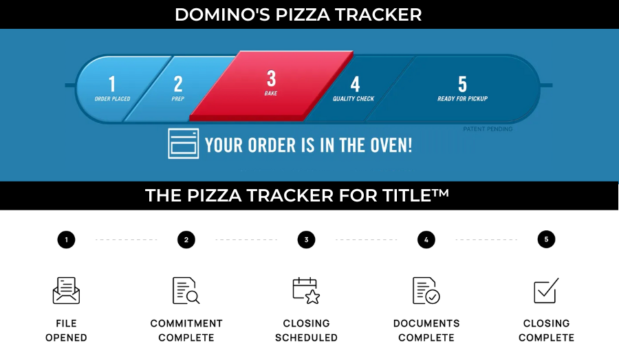
Everything that CloseSimple does is centered around simplifying the communication during a real estate closing process; from our custom branded email or text message updates, to our client-facing portal updates, and most the Pizza Tracker for Title™ visual timeline,.
So simplicity is central to our brand as we strive to provide Title & Escrow companies with simple solutions to help them do more with less work.
That brings us to our logo ... why two circles?
Section 2: Our 2 horizontal, overlapping circles:
A circle is a timeless, universal shape that is widely recognized ... plus it holds a lot of meaning and symbolism. Let's dissect a few aspects of the circle logo (and why there are two instead of just one circle):
-
Symbolism: Circles are often associated with unity, wholeness, and completeness. In many cultures, circles represent eternity, the sun, and the moon, and are often seen as a symbol of life. All of these symbolic meanings make the circle a perfect choice for a logo, as they suggest stability, continuity, and longevity.
-
Balance: Circles are considered aesthetically pleasing to the human eye because they are a simple, symmetrical shape. This can make circles a natural and appealing choice for logos, symbols, and other design elements. In visual design, circles are also used to create a sense of balance and stability, which can be calming and aesthetically pleasing to look at.
- Efficient: The phrase "Let's not reinvent the wheel" is a phrase commonly heard around offices. When faced with a challenge, it is easiest to go with a tried-and-true solution. The modern wheel is still the most efficient shape when it comes to moving objects from point A to point B. During the real estate closing process, we strive to help the client through the closing process with as little resistance as possible.
- Two Circles: To tag along the lines of symbolism, our two circles, touching, represent unity and teamwork, but also progression towards a goal. There are a lot of things that must happen during the real estate closing process, but our goal is to help title companies communicate the otherwise "complicated" process, in a simple way: utilizing our four or five step visual timeline (we've coined it "The Pizza Tracker for Title™"). Each circular milestone that gets "completed" in a Title companies Pizza Tracker timeline, pulls the recipient one step closer to the end goal: the closing (the big circle).
.png?width=948&height=316&name=Hubspot%20In-Post%20Image%20(5).png)
Section 3: From the Pizza Tracker for Title™ to Closing Communication, Simplified.
Our team works hard to help Title and Escrow companies efficiently (and effectively) communicate with Buyers, Sellers, Real Estate Agents & Lenders during the real estate closing process.
We do this by integrating with leading Title Production Software (that the Title or Escrow company is already on), and automatically sending updates via Branded Email and Text Messages, as well as updates within our customizable Client Facing Closing Portal.
Since companies like Amazon, UPS, FedEx, Dominos Pizza and countless others have invested so much into their digital communication process, consumers now expect up-to-date communication at every step of any process - along with on-demand access to information.
The Dominos Pizza Tracker changed the game by providing real-time updates on the status of their pizza orders.
Prior to Dominos "Pizza Tracker," customers had to rely on phone calls or in-store updates to know when their food would arrive, and there was often a lack of transparency and accountability in the delivery process. However, with the innovation of the Pizza Tracker, customers could log into the Dominos website or app and see exactly where their food was in the preparation and delivery process, and when they could expect it to arrive. This provided a new level of convenience, transparency, and accountability in the delivery process, and set a new standard for customer communication in the pizza industry, improve customer satisfaction, build trust, and increase brand loyalty.
The Pizza Tracker has since become a popular feature for many other food delivery and e-commerce companies, and has helped to raise the bar for customer communication and service in many industries ... And it also got us thinking ... could a visual timeline like the Dominos Pizza Tracker help the Title & Escrow industry? ... because if a consumer can know the status of their $10 Dominos pizza, why shouldn't they also know the status of their $500,000 home closing?

CloseSimple has adopted this methodology to enhance the communication during the real estate closing process by visually showing the closing timeline of what is going on at every step of the closing process.
.png?width=946&height=315&name=Hubspot%20In-Post%20Image%20(3).png)
However, as we thought about our brand refresh, we did not want our "features" to define our "product," because CloseSimple is more than:
- a "pizza tracker" visual timeline.
- a text messaging platform.
- an email delivery system.
- a branded client-facing portal.
CloseSimple exists "to simplify the closing communication," so going forward, we are choosing to lean into our "why" (the impact we can make), instead of just "how" we do it (with features).
.png?width=946&height=315&name=Hubspot%20In-Post%20Image%20(4).png)
Section 4: The significance of Blue ... and Orange.
"Lack of communication" is often the #1 complaint of consumers during the real estate transaction.
This is not directed specifically at Title & Escrow companies however.
Consumers complain about Real Estate Agents and Lenders not communicating, just as they might complain about a Title or Escrow company; but the Title & Escrow company often leaves the last impression on the consumer.
So if the process with the Real Estate Agent or Lender has been stressful leading up to the introduction to the Title & Escrow process, what do you think the consumer is expecting leading up to the closing day?
Blue is often associated with calmness and tranquility.
This is why blue is often used in interior design and marketing to evoke a sense of peace and serenity. That is also a strong reason why the CloseSimple branding features blue and green gradients (without fully committing to "corporate blue" because we want our brand to feel alive and not stagnant) ... evoking peace and tranquility in an otherwise complicated process.
You will notice however that we don't simply utilize shades of blue and green. We also use orange and shades of orange. This is very intentional because while blue calms, orange attracts attention. Whenever someone sees the orange, it attracts the attention to one of two things:
1. A Call-to-Action on our website or social media where we are trying to focus the viewers attention on one specific thing. This is reserved for buttons on our site or product feature images (which will help our customers) on our social media.
2. A Customer testimonial or photo vignette. We believe Title & Escrow Agents are the rockstar of the closing process and real estate transaction. While real estate agents and lenders can often steal some of the glory, the Title or Escrow professional is the one who is responsible for pushing the transaction across the "finish line." When we use images of our customers with a testimonial or anything customer-related, we will feature a black and white headshot with the attention-grabbing orange background.
.png?width=946&height=552&name=Blog%20Social%20Sharing%20or%20Full%20Width%20Blog%20Image%20Template%20(1).png)
Our goal is to not only simplify communication during the closing, but also to help unlock the potential that Title & Escrow companies have to create a remarkable closing experience for all parties, so our logo and brand representation carries the calming sense of a blue hue and gradient, while directing attention to the people we are serving: Title & Escrow professionals.
Section 5: Why our logo takes a backseat to our customer's logo.
We believe the Title & Escrow company deserves the recognition and praise for all the hard work done during the closing process (often doing things that consumers, real estate agents and lenders do not even know about). So as a software partner, we want to take the backseat to our customers' brands.
CloseSimple is NOT the company doing the hard work - you are! So at no point during the closing process does a consumer, Real Estate Agent or Lender need to see the CloseSimple logo.
We put your logo front and center so you can get all the recognition ... instead of us.
We're excited to serve the Title & Escrow industry with unmatched customer service and support; and we strive to keep things simple for our customers. That means our teams process all decisions through the lens of "how will this affect our customers?"
Our logo is an extension of this methodology.
Simplicity wins, and we want to help Title & Escrow companies win in every aspect of business... so we try not to overcomplicate any part of our business.
Interested in seeing how CloseSimple could help your Title or Escrow company? Schedule a Live Demo with one of our team members and hopefully you will fall in love with how CloseSimple could help simplify your business.
bogid - 27787114388
Related posts

Article
Uber, Dominos, + 5-Step Streamlined Communication in Title

Pizza Tracker for Title
[PRESS RELEASE] CloseSimple Text Messaging

Resources
Your Brand Could Be Your Strongest Defense Against Fraud

Article
How the Domino’s Pizza Tracker Changed Consumer Expectations